A popular idea in enterprise AI goes like this. Language models can now read code, review configurations and check patches. Research on “repeated sampling” shows that if you let a model try a problem many times, the share of problems it eventually solves keeps rising. So, the argument goes, security is turning into a compute problem: buy more inference, run more attempts, and your systems get safer.
Part of this is true. Studies have shown real gains from repeated attempts on specific benchmarks, and DARPA’s AI Cyber Challenge showed that automated analysis and repair can work on realistic software. The problem is that the argument quietly treats several different things as one. An AI that produces more reports hasn’t necessarily found more distinct problems. A problem it found hasn’t necessarily been confirmed. A confirmed problem isn’t necessarily a real one. And even a real, confirmed problem doesn’t make you safer until someone fixes it in time.
Our paper separates these steps and asks what can honestly be said about each. It offers a consistent way to reason about AI-assisted security under real limits on money, time and people, plus a set of counterexamples showing where common assumptions break down. For anyone buying, building or evaluating AI for security, those counterexamples are the most useful part.
The paper Compute-Bounded Security Assurance: Coverage, Verification, and Response under Resource Constraints Jithin VG and Ditto PS, Bud Ecosystem — arXiv:2609.09229 [cs.CR] →Four things that sound alike but aren’t
The paper starts by pulling apart four quantities that dashboards and vendor slides often merge:
- Repeated success — how often attempts succeed.
- Unique coverage — how many different problems have been resolved at least once.
- Accepted evidence — what a checker has approved.
- Operational protection — whether harm has actually gone down.
The difference is easy to see with an example. An AI that solves the same easy problem a hundred times has a great repeated-success rate and almost no coverage. The two numbers move independently, and only one of them is what you were trying to buy.
The paper is equally precise about what is being assured. You fix a system version, its configuration, the properties it should hold, and the evidence you will accept. Change any of those and the claim changes with it.
This leads to a subtle but important point. Every real vulnerability sits among the unproved obligations, but “unproved” is not the same as “vulnerable” — the set of things you haven’t established is always larger than the set of things that are actually wrong.
Finding 1: a real coverage ceiling comes only from impossible problems
The core model is simple to state. Suppose you repeat the same assessment procedure many times. Each problem has its own hidden difficulty, and coverage after n attempts is:
In plain terms, (1 − Θ)ⁿ is the chance that a problem survives all n attempts unsolved. Averaging that across all problems and subtracting from one gives the share you have covered.
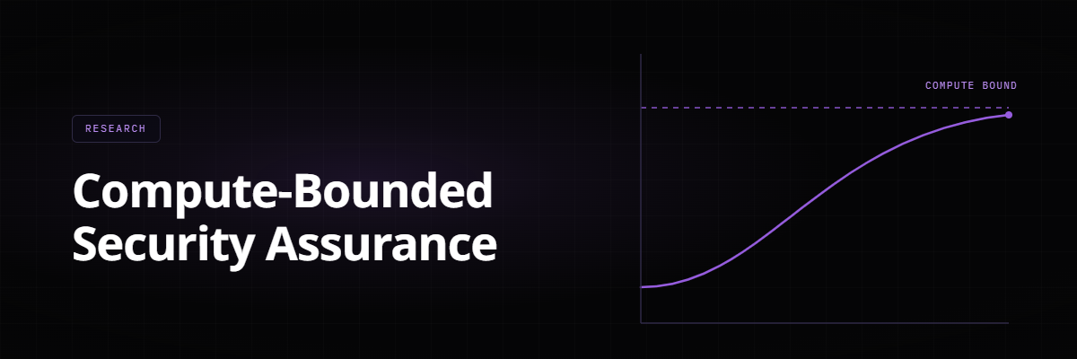
The interesting part is what happens as attempts go to infinity. Coverage approaches 1 − P(Θ = 0) — one minus the share of problems the method can never solve. A ceiling below 100% exists if and only if some problems have exactly zero chance.
Picture a hallway of locked doors and a bunch of keys you try at random. Some doors open fast. Some are hard. And some have no matching key at all — those are the ceiling, and no amount of trying changes them.
This matters because the two cases call for opposite decisions. If problems are merely hard, the method works and the question is whether it is worth the cost. If some are impossible for this method, more compute will never reach them and you need a different method, not a bigger budget.
The model also confirms that each extra attempt adds less than the one before. But the paper stresses that diminishing returns look the same whether or not a ceiling exists — so a flattening curve tells you nothing about which situation you are in.
One more warning comes out of this model. People often take the average success rate and plug it into the familiar curve 1 − (1 − p)ⁿ. Because of how averages interact with that curve, this systematically misstates coverage whenever difficulty varies across problems.
Finding 2: correlation doesn’t tell you where the ceiling is
Here is a common shortcut. Attempts from the same model on the same prompt tend to succeed or fail together, which statisticians call correlation. So people borrow the “effective sample size” idea to discount their attempt count and estimate where coverage will land.
The paper shows this doesn’t work, using a clean counterexample. It builds two systems with the same average success rate (10%) and the same pairwise correlation, whose coverage behaviour diverges completely.
In the first, problem difficulty follows a smooth Beta(0.9, 8.1) distribution in which every problem has some chance of being solved, so coverage eventually reaches 100%. In the second, 10/19 of problems have a 19% success rate and the other 9/19 have a success rate of exactly zero — so coverage stops at 10/19, about 52.6%.
The effective-sample-size shortcut predicts about 65.1%, which matches neither. Worse, after two attempts the two systems produce exactly the same coverage, so a short pilot cannot distinguish them at all.
The reason is structural. The effective-sample-size formula measures how precisely you can estimate an average. Coverage depends on the chance that every single attempt fails — a different quantity that correlation does not pin down.
For the business, the takeaway is that a trial period tells you less than it seems. Two tools that perform identically in a two-week pilot can diverge sharply at scale.
Finding 3: no finite test can prove a ceiling exists
If a real ceiling comes from impossible problems, can you find it by testing long enough? In general, no.
The paper takes a system with some impossible problems and changes those problems so they have a tiny success chance, ε, instead of zero. After n attempts, the statistical distance between the two systems stays vanishingly small for any realistic n.
Put simply: a problem that can never be solved looks almost exactly like one that gets solved once in a million tries. No affordable amount of testing separates them.
So when a vendor or benchmark says “performance plateaus at 70%,” read it as “this is what we observed within the budget we tested, plus an assumption about what lies beyond it.”
Finding 4: “approved” isn’t the same as “correct”
Every AI security workflow has a filter between “the model proposed something” and “we act on it.” The paper describes that filter with three numbers — how common real problems are (π), how often the checker catches them (v), and how often it wrongly approves a non-problem (f):
This is the same reasoning doctors use to interpret a positive test for a rare disease, and the numbers are just as surprising. Take π = 1%, v = 90% and f = 1%: fewer than half of approvals are correct, despite a checker that sounds excellent.
This is the arithmetic behind reviewer fatigue. A checker’s sensitivity on its own says little about whether its approvals can be trusted, because real problems are rare and false approvals are drawn from a much larger pool.
The paper also sets an error budget for long campaigns: if each checking decision has at most a known chance of wrongly approving something, the total risk across a campaign can be bounded. And it separates kinds of evidence — a formal proof checker establishes something relative to a precise specification; a crash or a mismatch is weaker evidence of a different kind.
Measuring whether evidence actually helps
When you give a model better evidence, how do you tell whether it became more factually grounded? The paper recommends proper scoring rules, which reward a model for being both accurate and honestly calibrated about its confidence.
It also separates participation from correctness. A model that attempts fewer tasks isn’t more accurate because of that. Refusing, lacking information and being wrong are three different outcomes and should be counted separately.
Finding 5: whether a cheaper model can substitute depends on cost per attempt
A common claim is that a smaller, cheaper model with more attempts can match a larger one. The paper treats this as a cost calculation. For a single problem, the number of attempts needed to reach a target success level s, when each attempt succeeds with chance p, is:
For a 95% target, a model with 10% success per attempt needs 29 attempts; one with 2% needs 149, roughly five times as many.
The attempt ratio isn’t the cost ratio, though. Total cost is setup cost plus cost per attempt times the number of attempts — and cost per attempt has to include everything, not just tokens.
| Weaker model’s cost per attempt | Weaker model’s total cost vs. stronger model |
|---|---|
| One-tenth as much | About 0.51× — the cheaper choice |
| 1.6 times as much | About 8.2× — far more expensive |
So a benchmark gap alone can’t tell you which model to buy. There is also a trap in optimising ratios like “coverage per FLOP” or “cost per finding”: for a typical diminishing-returns curve, the ratio is highest at a very small number of attempts, which is not the operating point you actually want.
The paper asks for complete resource accounting. FLOPs, time, money and energy are different quantities. Faster hardware saves time and energy but doesn’t change how many attempts a problem needs.
Finding 6: your pipeline moves at the pace of its slowest stage
The paper models security assessment as a pipeline — gather evidence, assess, check, review, deploy. Each stage has limited capacity, and a stable pipeline can’t accept work faster than its narrowest stage.
In a synthetic example, three stages process 100, 30 and 10 cases per second. The pipeline as a whole stays stable only below 10 cases per second. Speeding up the first two changes nothing.
Amdahl’s law makes the same point. If AI inference is 20% of the total work and you make it 10× faster, the whole process gets about 1.22× faster — because the other 80% didn’t move.
Finding 7: detecting a problem isn’t stopping it
The most practical result concerns timing. The paper defines three clocks: time until harm happens, time until the problem is detected, and time from detection to an effective fix. When harm and detection arrive at random with steady rates (α for harm, γ for detection) and fixing takes a fixed time m:
The first part is the chance you detect before harm. The second is the chance harm doesn’t happen while you are still fixing.
With the paper’s example rates (α = 0.02 and γ = 0.10 per second), prevention is about 83% if fixes are instant. With a 30-second fix time it drops to about 46%.
Now suppose detection is perfect and instant. The first term becomes 1, but the second remains — and with a 30-second fix, prevention still reaches only about 55%. Perfect detection does not rescue slow response.
Two popular generalisations don’t survive this analysis. The first is that the defender wins by discovering problems faster than the attacker; that is a race probability, not a prevention guarantee. The paper replaces both with an explicit expected-loss model: for each scenario, multiply likelihood by damage by the chance the control fails.
A safer design: separate suggesting, checking, and acting
The paper proposes a conceptual architecture — not an implemented product — built on a principle familiar from banking: the person who suggests a transaction is not the person who approves it.
The flow has six stages. Versioned evidence records what system, version and environment the evidence came from, who collected it and when. Bounded assessment is where the AI works, under explicit budget. Then independent checking, human review, an authorised change process, and deployment with monitoring.
Some of the rules are worth stating plainly. The AI’s output is never permission to act. Everything the AI reads — code, documents, logs, its own prior output — is treated as untrusted input. And the authority to act runs through the change process, not the model.
How to test these systems fairly
The evaluation guidance is one of the paper’s most directly usable parts. It recommends testing in three settings: synthetic problems where the right answer is known, historical cases with documented outcomes, and live use with careful controls.
Before testing, teams should decide what counts as success, what counts as the “same” finding, what evidence is allowed, the full budget, and the deadlines — in advance, not after seeing results.
When comparing a cheaper option against a reference, the paper recommends non-inferiority testing: decide in advance how much worse is still acceptable, and test against that margin rather than against a tie.
What this means for business
The paper is mathematical, but its consequences are practical.
If you are buying AI security tools, ask whether “coverage” is measured against a known set of distinct problems, and what budget the quoted plateau was observed within.
If you manage budgets, the substitution analysis shows that “a cheap model with more tries” can be a smart move or an expensive mistake — and only the full cost per attempt tells you which.
If you run security operations, the timing result is a strong argument for investing in the less visible parts of the process: faster approvals, reliable deployment, rehearsed rollback.
If you build AI platforms, the architecture points to design choices that matter well beyond security — tracked evidence and versions, and a firm line between suggestions and actions.
If you answer to auditors or regulators, the paper provides precise language for stating what an AI-assisted assessment has and hasn’t established: declared scope, stated budget, and the evidence actually accepted.
What the paper doesn’t claim
The paper reports no benchmark results, no hardware comparison, no claim that one model matches another, and no model of how attackers and defenders interact strategically. Its contribution is the separation of the quantities and the counterexamples, not a measurement of any particular system.
- Compute is one input to security, not a measure of it. What deserves optimising is the number of distinct, correctly confirmed, on-time outcomes within your budget.
- Correlation between attempts describes variance, not ceilings. A true ceiling comes only from problems that can never be solved — and no affordable test reliably finds it.
- Detection is not prevention. With a 30-second fix time, even perfect instant detection prevents only about 55% of harm.
None of this is an argument against using AI for security. It is an argument for investing in better evidence, sound checking, effective controls and fast response — rather than assuming that a larger inference bill is the same thing as a safer system.
Every number in this article is a worked example computed from a formula in the paper, not a measurement of a deployed system. The paper reports no benchmark results. Its authors also disclose that an AI assistant helped with mathematical checking.